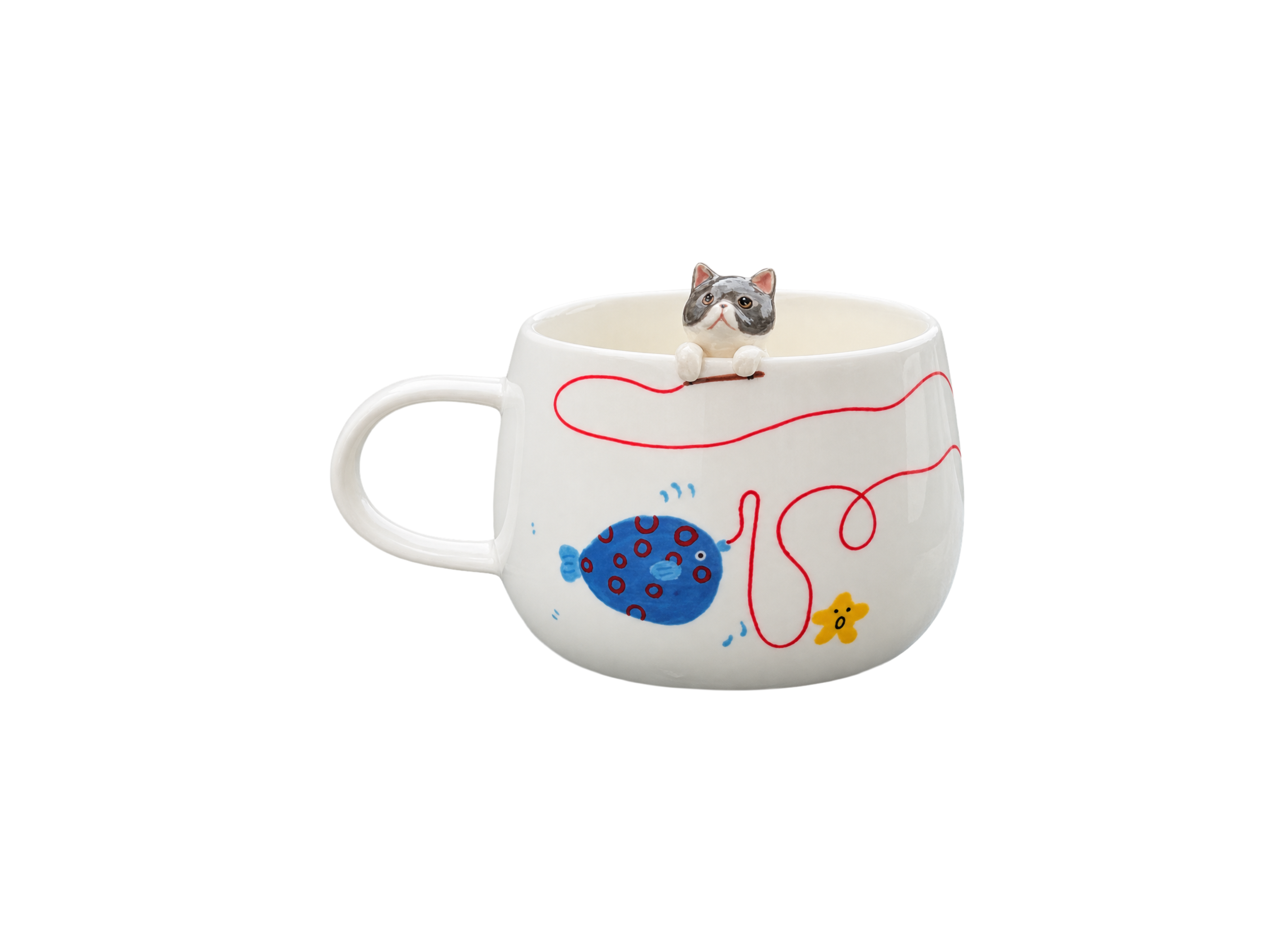
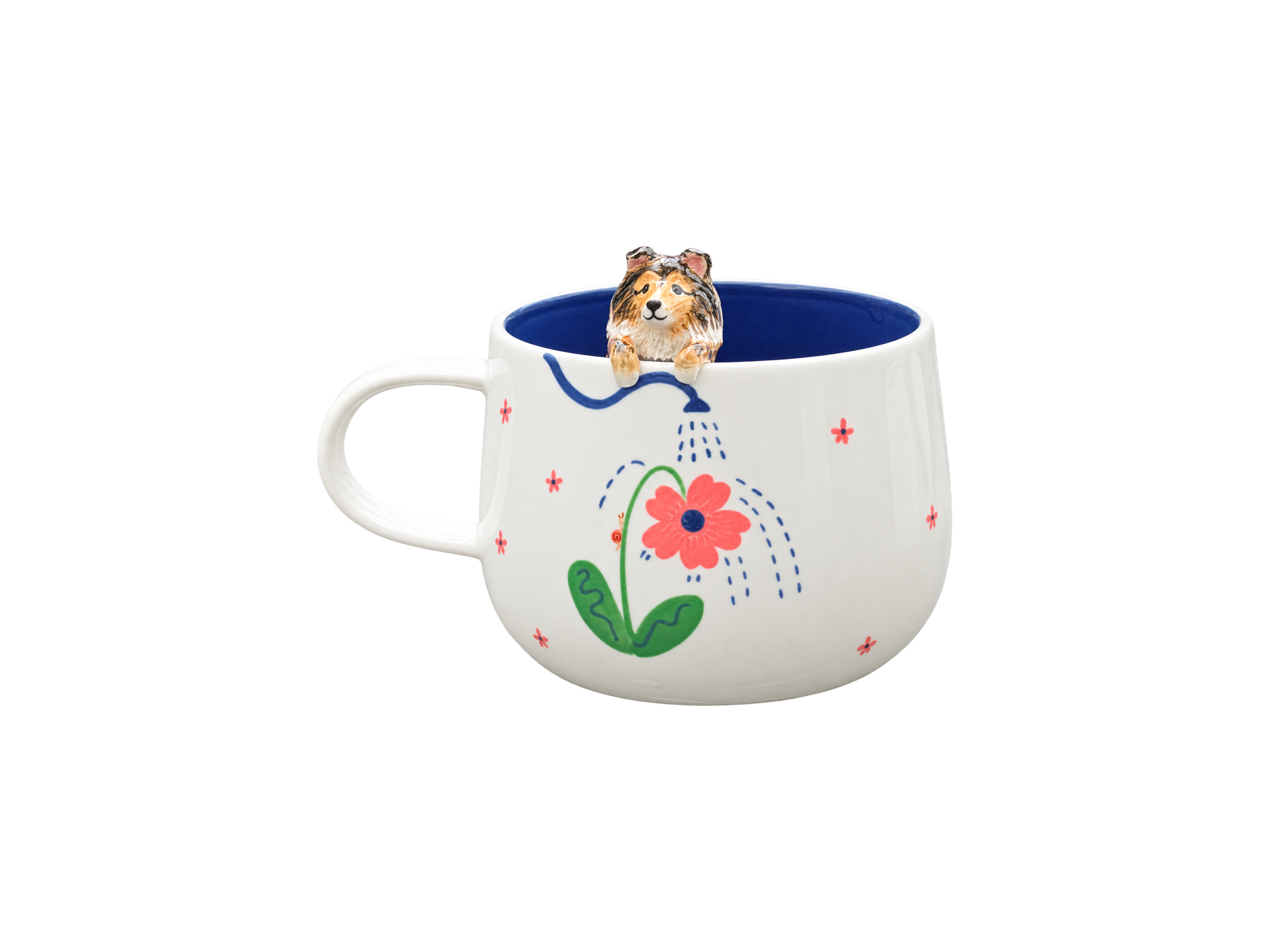
A background should make your pet easier to recognise, not compete with the face. The best choice depends on four things: the animal’s coat, the difference between light and dark areas, the mood you want, and where the finished piece will live. Begin with clarity, then refine the colour so the portrait feels personal rather than merely coordinated.
Start with the pet, not the paint chart
It is tempting to choose a favourite colour first. For a custom pet portrait, a better starting point is the animal itself. Look at the face, coat and distinctive markings before considering the room or the season.
Ask one simple question: which background lets me notice the expression immediately? If your attention goes first to a bright wall, a decorative pattern or a strong colour block, the background is probably doing too much. The pet should remain the visual centre, even when the surrounding colour has personality.
This matters especially on a small format, such as a painted ceramic piece. A large canvas can hold scenery and subtle transitions; a cup or compact keepsake has less space. At that scale, a quiet background often gives the eyes, muzzle and coat markings more room to read clearly.
Contrast matters more than finding a perfect colour
People often search for the “best” background for a black dog, a white cat or a golden retriever. There is no single correct colour. What matters first is contrast: the pet’s outline and important facial features should not disappear into an area of almost the same lightness.
For black or very dark coats
A very dark background can look elegant, but it may absorb the edge of the ears, muzzle or chest. Mid-tone blue, muted green, warm grey or soft taupe can create separation without making the portrait feel harsh. If you prefer a dark-on-dark effect, check that the reference photo still shows highlights along the face and silhouette.
For white, cream or very pale coats
Pure white is rarely the only colour visible in pale fur. Cream, beige, cool grey and warm reflected light often shape the face. A slightly deeper background—dusty blue, sage, clay, charcoal or muted rose—can preserve those soft transitions. A very pale background may still work when the edges are defined by shadow, but it needs more careful handling.
For golden, brown or red coats
Cooler muted colours often offer a useful counterpoint to warm fur. Think of softened blue, blue-green or deep sage rather than highly saturated turquoise. Warm neutrals can also work when the goal is calm harmony rather than obvious contrast.
For grey, silver or multicoloured coats
Grey coats can feel flat against another grey of similar value. A controlled warm neutral, dusty pink, olive or navy may give the portrait more depth. For pets with several strong coat colours, a quieter background is usually easier to balance than one that introduces several new hues.
Use this quick decision guide
| Pet or portrait feature | Useful starting direction | Main risk to avoid |
|---|---|---|
| Black or dark coat | Mid-tone blue, sage, warm grey or taupe | Losing the silhouette and dark eyes |
| White or cream coat | Dusty blue, muted rose, olive or charcoal | Washed-out fur edges |
| Golden, brown or red coat | Soft blue-green, deep green or restrained neutral | An overly bright complementary colour |
| Grey or silver coat | Warm beige, clay, dusty pink or navy | A flat grey-on-grey result |
| Multicoloured coat | One calm, low-saturation colour | Too many competing colours |
| Several pets together | A neutral that separates every coat | A background that suits one pet but hides another |
These are starting points, not rules. Always judge a colour beside the actual reference photograph. Light direction, coat undertones and facial markings can change the result.
Do not confuse the photo background with the portrait background
A good expression can appear in a photograph taken on a sofa, in a kitchen or beside a busy garden. That does not automatically mean every object behind the pet belongs in the finished artwork.
When you place an order, distinguish between two separate decisions:
- The reference photo supplies the face, posture, coat and expression.
- The portrait background controls the visual space around the animal.
A cluttered reference photo can sometimes be simplified, but the pet itself must still be clear enough to interpret. Before ordering, ask which elements can be removed, softened or changed within the chosen product and style. Do not assume that every studio or technique offers the same degree of background editing.
If the photograph is old, small or slightly blurred, first evaluate whether it preserves the animal’s essential features. The background can be simplified; missing information in the face cannot be recreated with certainty.
Choose the mood before choosing the exact shade
Colour is easier to select when you describe the feeling you want. “Blue” is broad; “quiet and airy” is a direction. “Green” is broad; “botanical and understated” is a direction.
- Calm and timeless: dusty blue, stone, soft grey or muted sage.
- Warm and intimate: clay, warm beige, gentle ochre or subdued rose.
- Graphic and modern: deep navy, charcoal or a clean contrasting tone.
- Playful but refined: a softened version of a brighter colour already present in the collar, eyes or favourite accessory.
- Memorial and contemplative: restrained neutrals or a colour associated with a meaningful place or memory.
The final choice does not have to describe the pet’s personality literally. A lively dog can be shown against a calm background; a quiet cat can look striking against a deeper colour. The useful test is whether the mood feels true to how you remember the animal.
Let the room guide you—without letting décor take over
If the portrait will be displayed in a particular room, note the dominant materials and colours. Warm wood, pale stone, white shelving, dark paint and patterned textiles all change how a piece is perceived.
You do not need an exact match. In fact, matching a cushion or wall colour too precisely can make a keepsake feel tied to one decoration scheme. A related neutral or a quieter complementary colour often remains easier to live with over time.
Consider three practical questions:
- Will the portrait sit against a light or dark surface?
- Are the surrounding colours mostly warm, cool or neutral?
- Do you want the piece to blend gently into the room or become a small focal point?
Pay attention to scale and portrait style
For painted portraits, the background can frame the face and influence the balance of the composition. For hand-modelled or three-dimensional details, the ceramic colour and surrounding decorative elements may play a similar supporting role. The more texture and detail the pet already has, the more useful visual restraint becomes around it.
If you are comparing formats, browse the Maison Scott custom pet creations and notice how scale, relief and placement change the relationship between the animal and its surroundings.
What if several pets appear together?
A multi-pet portrait should not choose a background for only the darkest or lightest animal. Place all reference photos side by side and look for a middle value that separates every coat reasonably well.
When one pet is black and another is white, a mid-tone background often offers the most balanced starting point. If the animals have complex patterns, keep the surrounding colour simple. Repeating a minor colour from one pet too strongly may unintentionally make that animal dominate the composition.
Also consider visual weight. A very dark background behind a dark large dog and a pale small cat may make the cat appear even lighter and more prominent. Balance is not only about colour names; it is about how much light, dark and detail each part contributes.
A simple selection method
If you are hesitating between several options, use this short process:
- Select the reference photo with the clearest expression and most recognisable markings.
- Classify the coat as mainly light, dark, warm, cool or multicoloured.
- Remove background colours that are too close in lightness to the dominant coat.
- Choose two or three remaining directions that support the desired mood.
- Compare them in the room where the piece will live, or against a photograph of that room.
- Ask the maker what can genuinely be adapted in the chosen format before placing the order.
If one option makes you notice the eyes first and still feels comfortable in the intended space, it is usually the strongest choice.
Questions to answer before ordering
- Which facial feature must remain the focal point?
- Is the coat lighter or darker than the proposed background?
- Should the result feel calm, warm, graphic or playful?
- Does a collar or accessory introduce a colour worth echoing?
- Will several pets need equal visual presence?
- Is the background editable in this product, or determined by the ceramic and design?
- Have the colour request and any elements to omit been written clearly?
For product-specific options, delivery timing and the information to provide with an order, consult the Maison Scott FAQ before confirming your creation.
Frequently asked questions
What is the best background colour for a black dog portrait?
A mid-tone, muted background is a dependable starting point because it can separate the ears, muzzle and chest from the surrounding space. Soft blue, sage, warm grey and taupe are worth comparing with the actual photo. A dark background can also work when the coat has clear highlights.
What background works well for a white cat?
Choose enough contrast to preserve the outline without overwhelming the softness of the fur. Dusty blue, olive, muted rose, clay and charcoal can all work, depending on the cat’s undertones and the mood of the piece.
Should the background match my home décor?
It should live comfortably with the room, but an exact match is unnecessary. A related neutral or restrained complementary colour is often more flexible if furniture, paint or textiles change later.
Can a messy photo background be removed?
Often the surroundings can be simplified in a custom artwork, but this depends on the product and technique. The pet still needs to be visible clearly, especially around the eyes, ears and coat edges. Confirm the requested change with the maker before ordering.
Should I use the same background for a portrait of several pets?
Yes, one shared background usually creates unity. Choose it by comparing all coat colours together and favour a value that keeps every animal distinct rather than optimising for only one.
The quietest choice is often the strongest
A thoughtful background does not need to announce itself. Its role is to hold the portrait together, protect the pet’s recognisable features and support the feeling you want the object to carry. Begin with contrast, refine the mood, then consider the room. When those three decisions agree, the background feels intentional—and the animal remains unmistakably at the heart of the piece.