A pet’s coat can look surprisingly different from one photograph to another because cameras do not record colour exactly as our eyes perceive it. Light temperature, automatic white balance, exposure, phone processing and even the screen used for viewing can all shift the result. For a custom portrait, the safest approach is to provide one clear main photo plus a small set of supporting images taken in neutral daylight.
The short answer: colour depends on more than the coat
Imagine a cream-coloured dog photographed beside a warm lamp at night, then again near a window on an overcast morning. In the first image, the fur may appear honey-coloured; in the second, it may lean grey or blue. Neither photograph necessarily shows the coat “incorrectly”. Each records the animal through a particular combination of light, camera settings and digital processing.
This is why choosing a reference image is not simply a matter of finding the sharpest photograph. A good portrait reference should communicate three things together: the pet’s expression, the structure of the face and body, and the true relationship between coat colours and markings.
Why your eyes and your camera can disagree
Light has its own colour
Daylight, shade, household bulbs and mixed indoor lighting do not share the same colour temperature. Warm lamps can make white or pale fur look yellow; open shade can make it appear cooler. When several light sources are present at once, one side of the animal may look warm while the other looks blue or green.
Cameras try to compensate through white balance. As Sony’s guide to white balance explains, the same white subject may look reddish under incandescent light or bluish under fluorescent light if the setting does not match the illumination. Automatic white balance is useful, but it has to make an estimate—and complex scenes can confuse it.
Exposure changes perceived colour
A very bright photograph can wash out subtle markings. A dark image can make chocolate fur look almost black or hide the tonal separation between a black nose and a dark muzzle. This matters particularly for animals whose identity lies in small contrasts: a pale blaze on the chest, a darker mask around the eyes, or a soft gradient along the ears.
Phones add their own interpretation
Modern phones routinely adjust contrast, saturation, shadows and highlights before an image reaches the photo library. These changes often make a picture more pleasing, but not necessarily more faithful. Portrait modes may also soften fur edges or blur the boundary between whiskers and background. For reference purposes, a natural-looking image is usually more useful than the most dramatic one.
Why “fixing the colour later” is not always simple
It is tempting to assume that any colour cast can be removed perfectly with an editing filter. In practice, correction becomes less certain once a camera has processed and compressed the image. A CVPR study on incorrectly white-balanced images notes that correction is difficult because rendered images have already passed through camera-specific, nonlinear processing.
For a commissioned portrait, that means an editor or artist should not have to guess whether a golden cast comes from the pet’s coat or from a lamp. Supporting photographs make that distinction much clearer. They are not there to replace the main image; they provide evidence when colour, markings or proportions are ambiguous.
How to build a reliable colour reference set
You do not need a professional camera or a formal studio. A thoughtful group of three to five images is usually more informative than a large folder of near-duplicates.
- Choose one main photograph for expression and pose. It should show the face clearly and feel recognisably like your pet. This image guides the overall composition.
- Add one photograph in soft natural daylight. Photograph near a window or outdoors in open shade, avoiding direct midday sun. Neutral daylight helps reveal the balance between warm, cool, light and dark areas of the coat.
- Add a close view of distinctive markings. Include the blaze, socks, ear edges, nose freckles, tabby stripes or patches that make the animal unique.
- Add a wider view if the body is part of the portrait. This helps clarify where markings continue across the chest, back, legs or tail.
- Send the original files when possible. Screenshots, messaging previews and social-media downloads may be smaller or more compressed than the original photograph.
- Include a short written colour note. A simple description such as “warm cream, not white” or “dark brown in sunlight, nearly black indoors” can resolve uncertainty without directing every artistic decision.
If you are unsure how many images to include, our guide to choosing photos for a custom pet portrait explains how a main image and supporting references can work together.
Your screen can change the colour too
Two people can open the same file and see slightly different warmth, brightness or saturation. Display settings are one reason. On iPhone, for example, Apple explains that True Tone adapts display colour and intensity to ambient light, while Night Shift moves the screen towards warmer colours.
Before judging a subtle coat colour, turn off temporary warm-display modes, set the screen to a comfortable mid-level brightness and view the image in ordinary neutral light. This will not calibrate a phone like a professional monitor, but it reduces the most obvious viewing shifts. It is also worth checking the same image on a second device if one version looks unexpectedly yellow, blue or saturated.
Common colour pitfalls by coat type
White and cream coats
White fur reflects the colour of its surroundings. Grass, a painted wall or warm flooring can create a visible tint. Cream pets may be mistaken for white when exposure is too bright, so include a daylight image that preserves the gentle warmth of the coat.
Black and blue-grey coats
Black fur often contains important tonal differences that disappear in shadow. Photograph with soft light falling across the face rather than from behind. Avoid heavy brightening filters: they may reveal noise while turning deep black into flat grey. A separate image of the eyes and muzzle can help preserve facial structure.
Red, golden and chocolate coats
Warm indoor light can intensify red and orange until a natural coat looks unusually coppery. Conversely, cool shade may mute it. A neutral daylight photograph gives a better anchor for judging the true warmth.
Brindle, tabby, tortoiseshell and merle patterns
Complex coats are not just a list of colours; their placement and rhythm matter. One clear close-up is valuable, but it should be paired with a wider view so the artist can understand the scale and direction of stripes, mottling or patches. If one side differs from the other, show both.
Which photograph should lead the portrait?
Choose the main photograph for what cannot easily be reconstructed: the familiar look in the eyes, the characteristic head tilt or a distinctive posture. Use supporting photographs to clarify coat colour and markings.
Background choice can also influence how a coat is perceived. A cool background may make warm fur feel richer, while a similar-toned background can create a quieter, softer effect. Our guide to choosing a background colour for a custom pet portrait explores that decision in more detail.
What if the only photographs are old?
For a memorial portrait, the available images may come from an older phone, a printed photograph or a dim indoor moment. Do not discard them simply because the colour is imperfect. Start with the image that best preserves the animal’s expression, then look for any other photograph that confirms the coat under different light.
If no supporting image exists, write down what you remember with modest, concrete language. “The chest patch was warm ivory” is more useful than “make it perfect”. It is also honest to leave a small degree of uncertainty rather than invent detail that the photographs never recorded.
A Maison Scott perspective on colour and likeness
Maison Scott’s personalised pieces are illustrated and artistic rather than photorealistic. A clear, bright reference helps the maker recognise the features that matter, but the finished object remains a hand-painted interpretation. The aim is not to reproduce every pixel. It is to hold on to the expression, markings and visual character that make the animal immediately familiar.
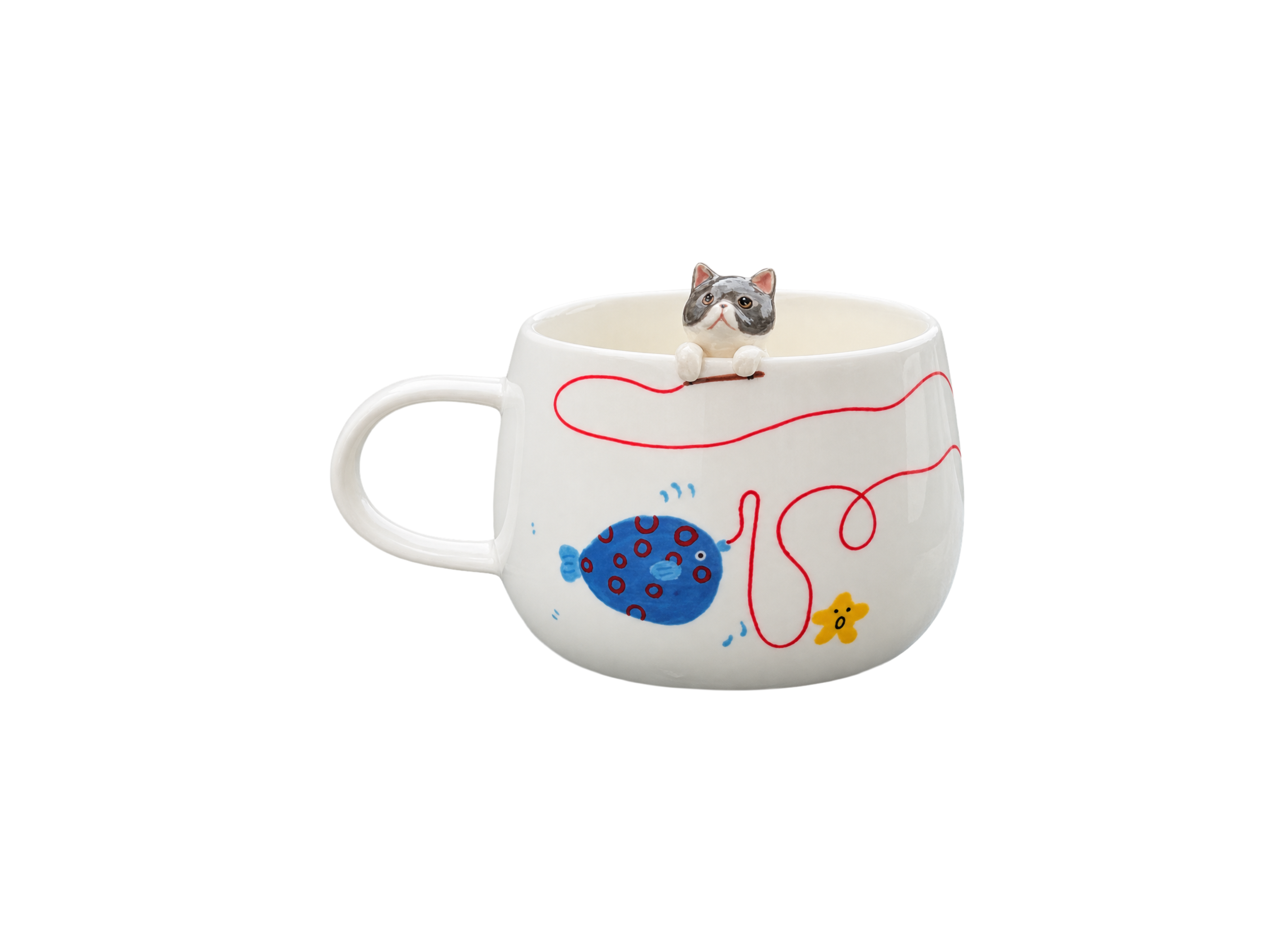
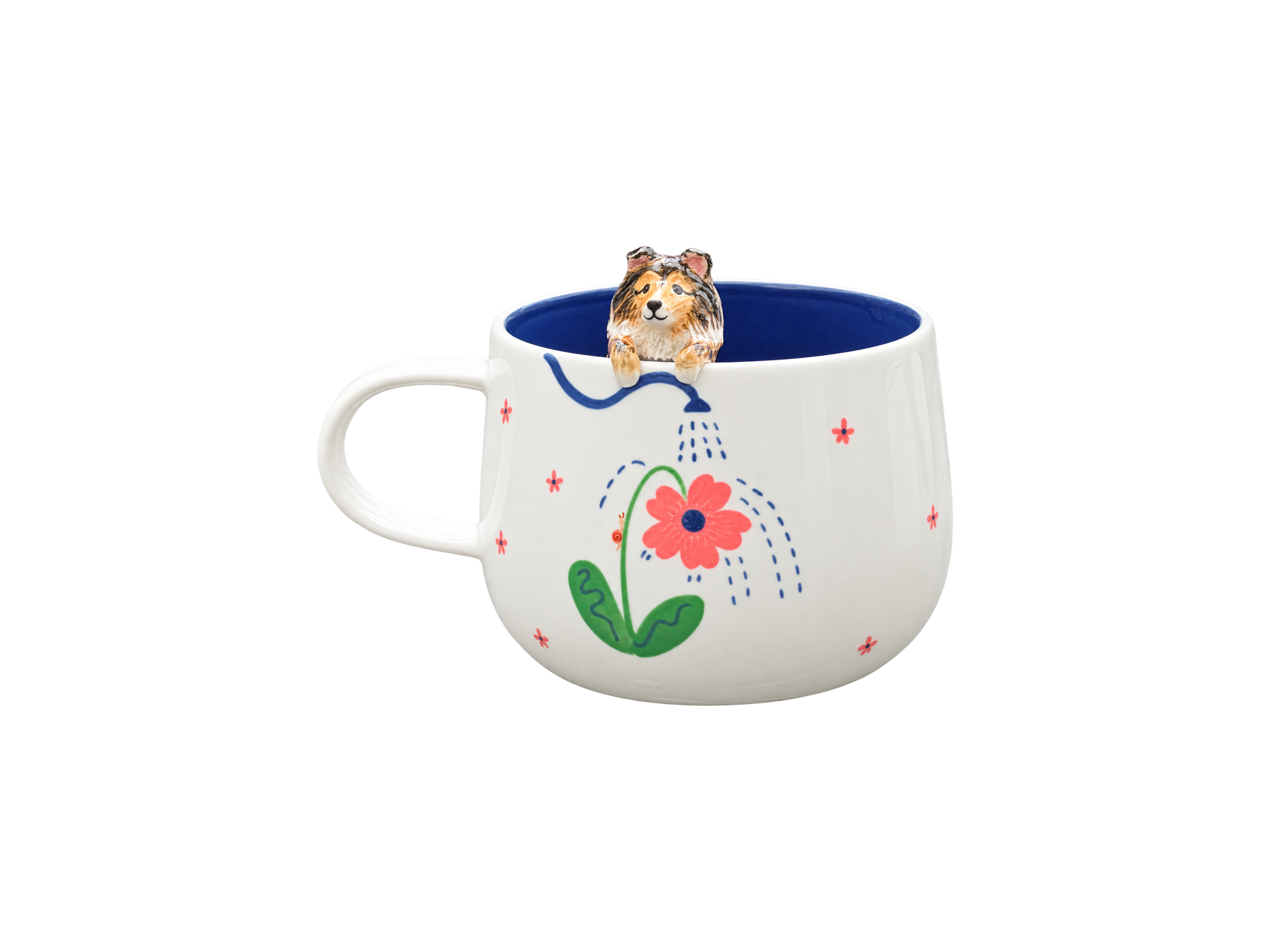
For the personalised mug with a hand-sculpted pet figurine, the portrait is based on the photographs you provide, and slight variations are part of the handmade result. A small, coherent reference set gives the artist better guidance than many heavily filtered images with conflicting colours.
A final checklist before sending your photos
- One main image clearly shows the expression and pose.
- At least one supporting image was taken in soft natural daylight.
- Distinctive markings are visible at a useful scale.
- The original files are included where possible.
- Filters and dramatic colour edits have been avoided.
- A short note explains any colour that photographs repeatedly misrepresent.
- Both sides are shown if the markings are asymmetrical.
Frequently asked questions
Should I use a colour chart when photographing my pet?
It is not normally necessary for a personal commission. Neutral daylight, an unfiltered original file and several consistent references are more practical. A grey or white object in the scene may offer context, but it should not distract or block the animal.
Is sunlight the best light for accurate coat colour?
Direct sun can create harsh highlights and deep shadows. Soft daylight near a window or outdoors in open shade is usually easier to interpret because it preserves detail across both light and dark fur.
Can I send photos taken on different phones?
Yes. Differences between phones can be useful if the images are clear and the lighting is known. Choose one main image, then explain which supporting photograph is closest to the coat colour you see in person.
Should I edit the photo before sending it?
Basic cropping is fine, but avoid strong filters, saturation changes and aggressive brightening. Keep the original file as well, so the artist can compare an edited crop with the unaltered source.
What if my pet changes colour with the seasons?
State which season or stage of life the portrait should represent and provide photographs from that period. This is especially helpful for pets whose coats lighten, darken or become fuller over the year.
A thoughtful reference set makes colour clearer
The most reliable photographs are not necessarily the newest or most polished. They are the ones that agree with one another about the pet’s essential colours and show the features that matter without heavy processing. If you are preparing a personalised piece, begin with one image that feels unmistakably like your companion, then add only the supporting views that make the coat easier to understand. You can explore Maison Scott’s personalised creations when you are ready.